Jesus says "Love the Lord your God with all of your heart, and with all of your soul and with all of your mind and with all of your strength." This blog looks at melding these all together in a healthy spiritually holistic way of living our lives for Christ.
Friday, July 8, 2011
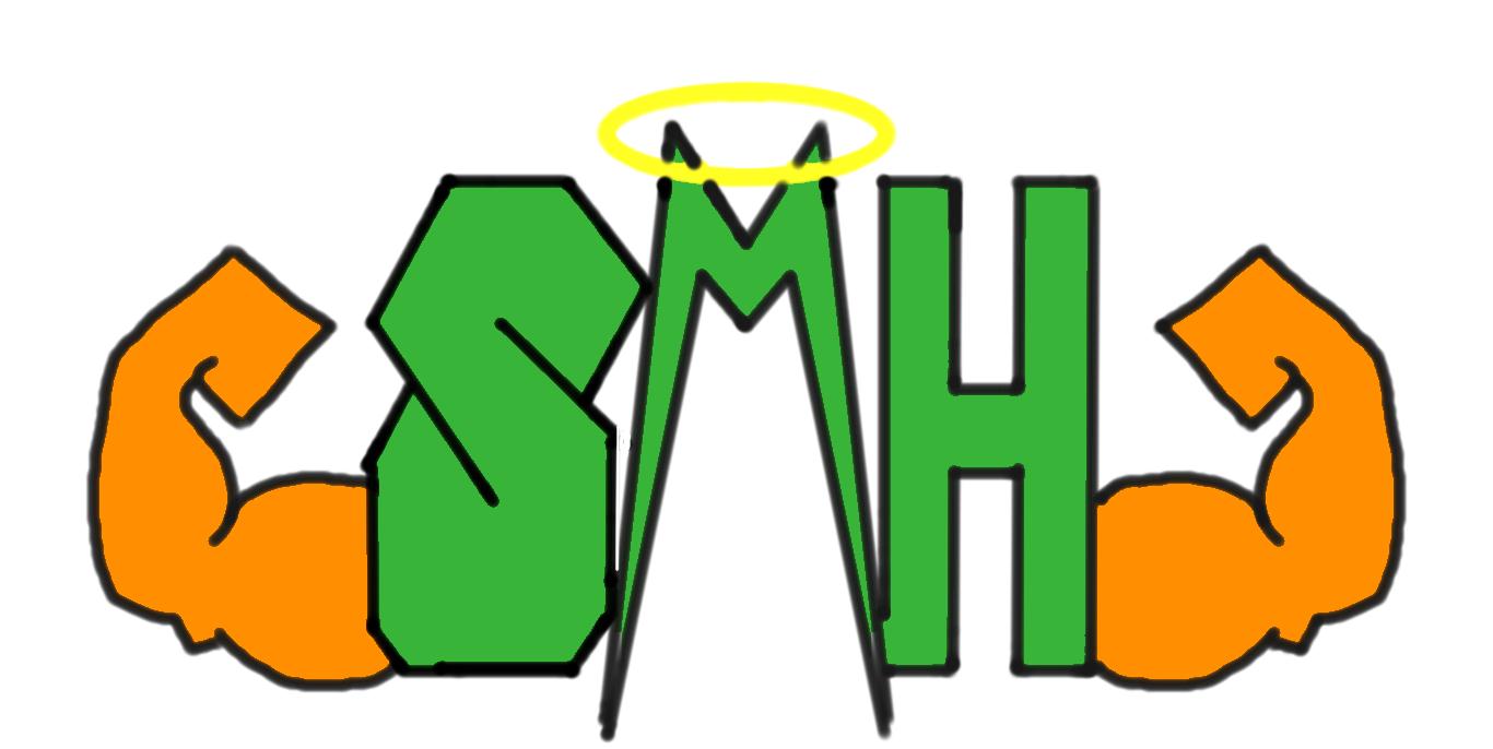
Logo submission
Hey all.. Here's a logo idea been fiddling around with. Thoughts?

I like it!
ReplyDeletethinking about getting rid of the wings. They look like Farah Faucet hair.
ReplyDeleteI second that. Wings just look kinda showy. Maybe kinda highlight the letters a bit, make them bigger?
ReplyDeleteI agree with Tom on the wings and letters, add shadowing perhaps?
ReplyDeleteTake two-I'm digging it!
ReplyDelete